Vouchify
Designing the Smart Collections feature to simplify invoice management, payments, and returns for distributors.

01 / Overview
The problem & the solution
Problem
Managing and verifying invoices, payments, and returns manually is time-consuming, error-prone, and lacks a cohesive system for streamlined operations.
Solution
The Smart Collections feature for Vouchify enables distributors to manage invoices efficiently, streamline payments and returns, and use real-time tracking and data visualization to make better decisions.
02 / Research
Talking to distributors
To ground every design decision in real needs, I started with primary research: interviewing people who live inside these workflows every day.
- Interviewed 8 distributors from various industries to understand their workflows, challenges, and needs
- Key findings: reliance on manual processes causing widespread inefficiencies, need for customizable settings (discounts, credit limits), strong demand for real-time tracking dashboards, importance of a blacklist feature for poor payment histories, and a consistent preference for simple interfaces
- Created affinity maps grouping insights into 6 themes: Manual Processes, Time-Consuming Tasks, Custom Needs, Real-Time Tracking, Blacklist Management, and Ease of Use
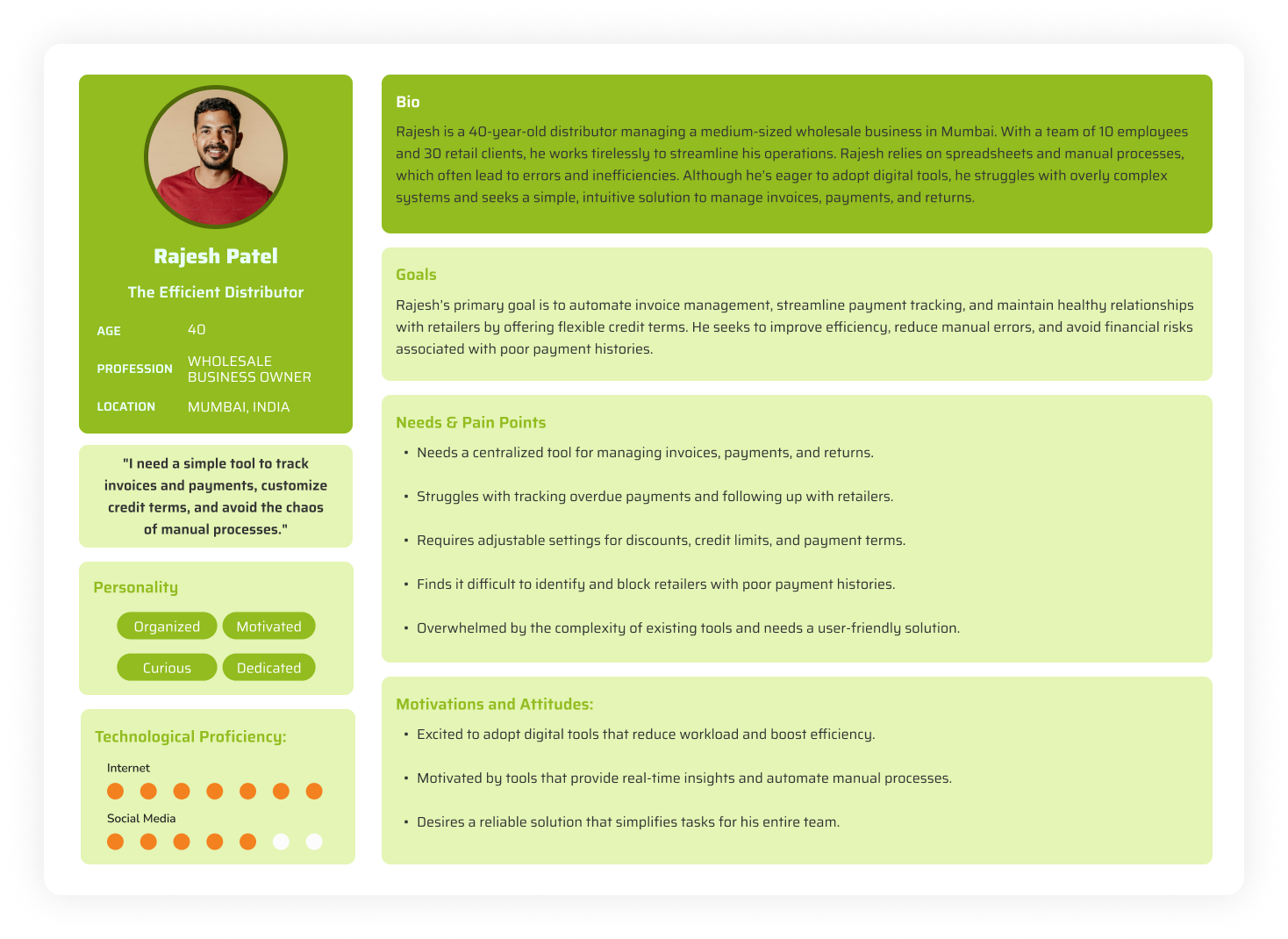
- Developed persona "Rajesh Patel, The Efficient Distributor," a 40-year-old wholesale business owner from Mumbai representing the core user group
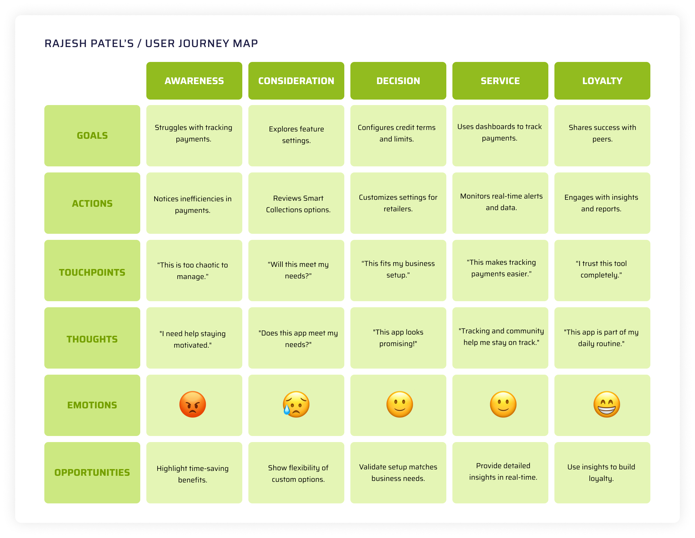
- Mapped the full user journey from recognizing operational inefficiencies to actively adopting Smart Collections
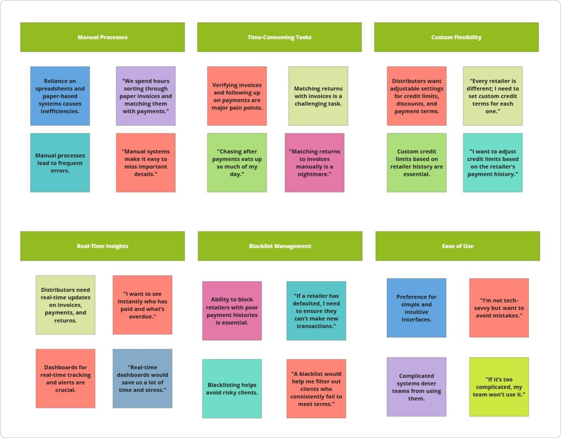
"Despite differences in business size and tech familiarity, all 8 distributors shared remarkably similar pain points. Manual processes were the universal bottleneck."
03 / Ideation
Structuring the solution
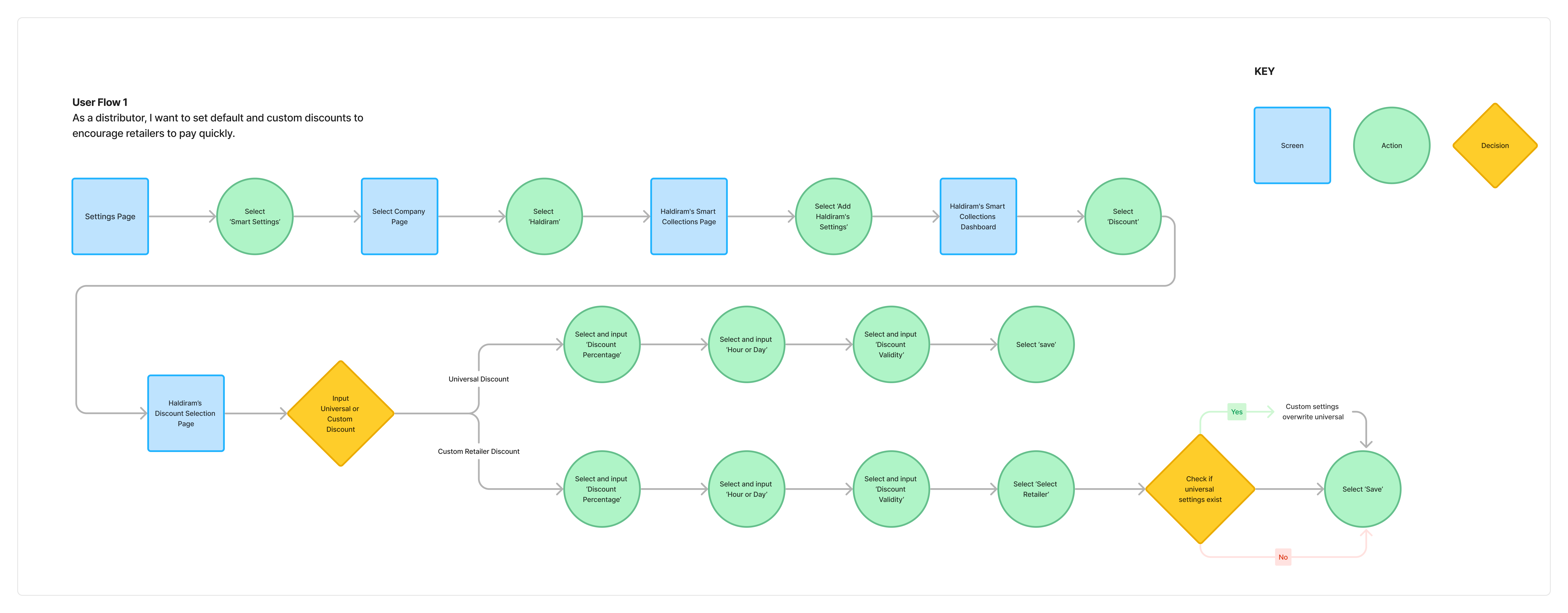
With research insights synthesized, I moved into defining the solution space through user stories and early sketches before committing to screens.
- Detailed user stories covering: default and custom discounts, credit periods and limits, pending voucher limits, collection guidelines, and retailer blacklist management
- Developed initial user flows outlining steps for discount settings, voucher management, and blacklisting retailers
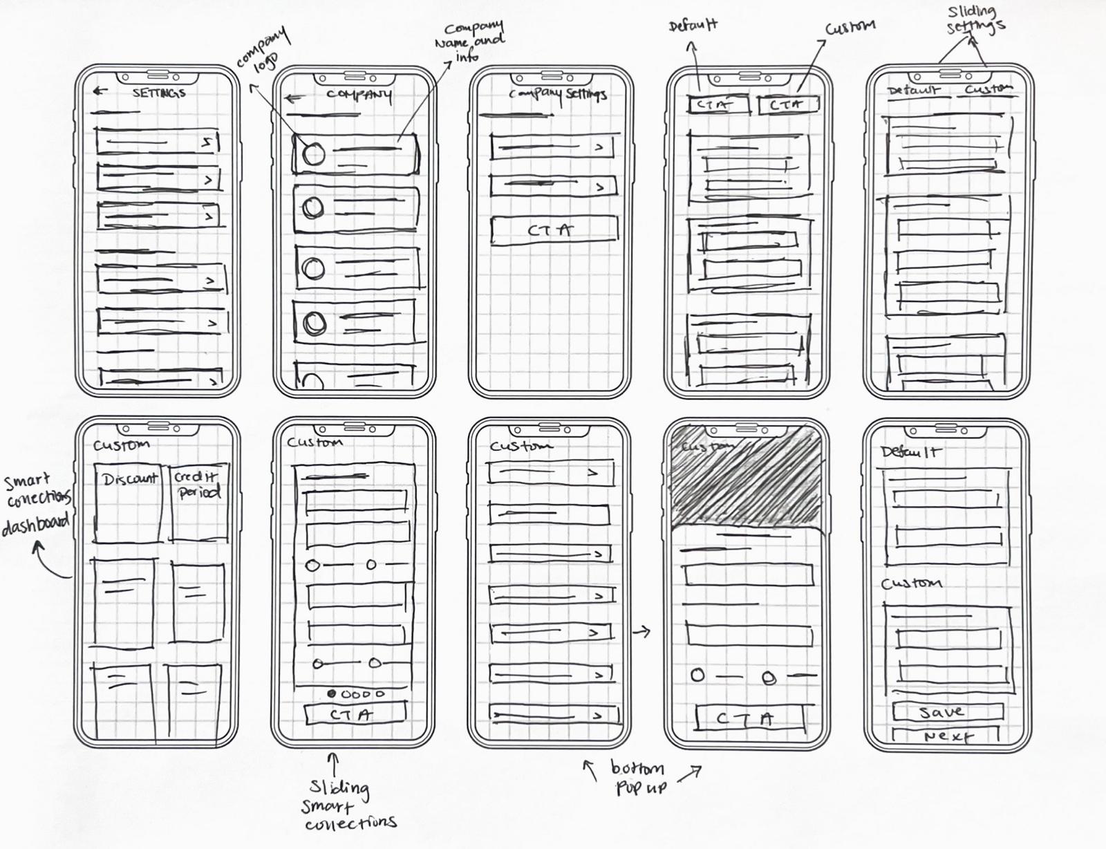
- Created rapid sketches for layout exploration, comparing single-page vs. multi-step navigation patterns early on
04 / Design
Iterating toward clarity
The design phase was defined by a key usability finding that reshaped the entire approach, caught early enough to save significant rework downstream.
- Developed 16 initial wireframe screens based on user flows
- Conducted a focused usability test with 3 distributors who flagged the initial single-page layout as cluttered with excessive scrolling
- Key feedback: overwhelming layout, loss of context while scrolling, strong preference for sectioned content with clear navigation
- Redesigned the user flow by breaking content into manageable sections, reducing scrolling, improving navigation, and creating a cleaner interface
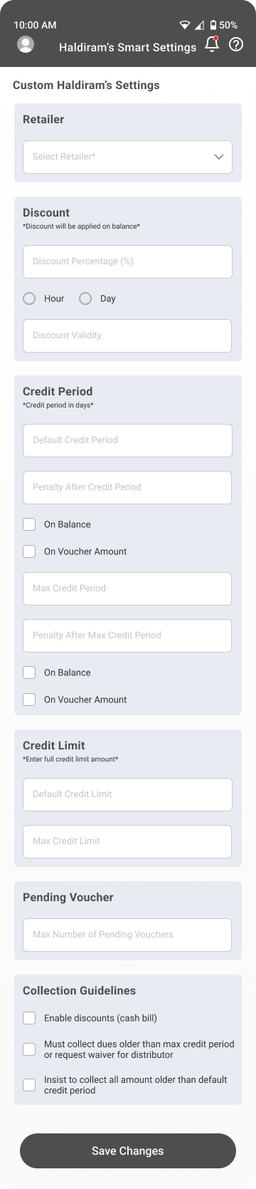
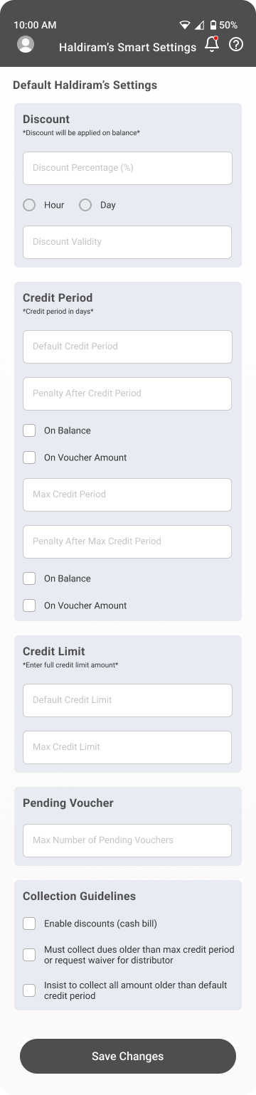
- Produced 25 high-fidelity screens addressing all initial challenges with a cohesive green/lime color system
- Built an interactive prototype covering the entire Smart Collections flow for stakeholder review
05 / Developer Handoff
Bridging design and engineering
A high-fidelity design is only as good as its implementation. I put significant effort into making the handoff thorough and unambiguous.
- Created comprehensive developer handoff documentation with detailed annotations for every screen
- Included precise measurements and spacing specs consistent with the mobile design grid
- Documented interaction details: scrollable dropdown menus, disabled save button until required fields are filled, form validation patterns, and toast message feedback on save
- Established consistent measurement standards that applied across the entire Smart Collections flow
"The handoff documentation became a reference standard for subsequent features, reducing design-to-dev miscommunication and speeding up implementation by an estimated 30%."
06 / Reflection
Key takeaways
Working on Vouchify taught me the value of thorough preparation and clear communication. Using user stories to align design decisions with actual distributor needs kept the team focused on what genuinely mattered.
The early usability test that revealed the single-page scrolling issue saved weeks of potential rework. It reinforced that testing early, even with a small group, is always worth the investment. Problems caught at the wireframe stage are cheap to fix. At hi-fi, they're expensive. Post-launch, they're painful.