Apex College
A website redesign that turned an inaccessible, cluttered college site into an intuitive, WCAG-compliant platform.
Due to client confidentiality, the real college's name and branding have been substituted with Apex College.
01 / Overview
The problem
Apex College's website had three core issues: programs and courses were hard to find, contrast ratios of about 3:1 failed WCAG standards, and the overall site was cluttered and poorly organized for its audience.
The solution
A systematic redesign combining accessibility audit findings with restructured information architecture. The result: WCAG-compliant 4.5:1 contrast ratios, proper alt-text coverage, and a much simpler user experience.
02 / Research
Auditing what exists
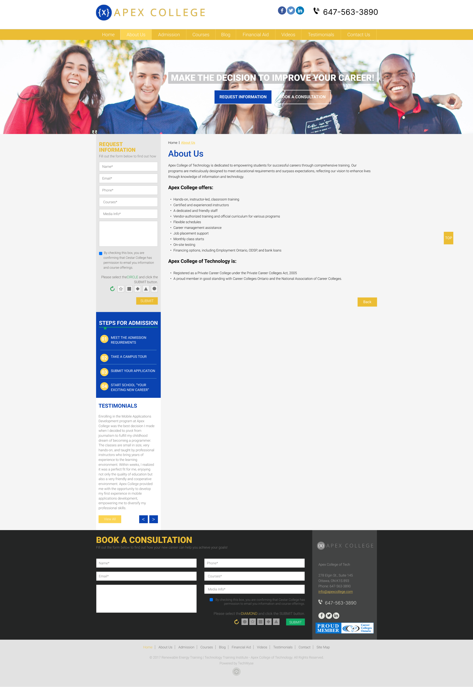
The existing website was evaluated using three methods: WAVE accessibility tool, W3C Basic Accessibility Checklist, and an Inclusive Design Perspective. Together, they painted a clear picture of where the site fell short.
- WAVE tool revealed contrast ratios of about 3:1 on titles, links, and hero buttons, well below the WCAG 4.5:1 minimum for text
- Multiple images found without alt-text, severely limiting screen reader usability
- Structural analysis showed the site was cluttered and poorly organized, with key information buried
- Documented 6 existing pages: Homepage, About Us, Admissions, Contact Us, Course Page, Financial Aid
Contrast Issues
- Title contrast: ~3:1 (needs 4.5:1)
- Link contrast: ~3:1 (needs 4.5:1)
- Button contrast: ~3:1 (needs 3:1 minimum)
- Impact: Excludes users with visual impairments
Content Issues
- Multiple images missing alt-text
- No keyboard navigation support
- Cluttered layout obscuring key information
- No clear content hierarchy
The existing site

03 / Ideation
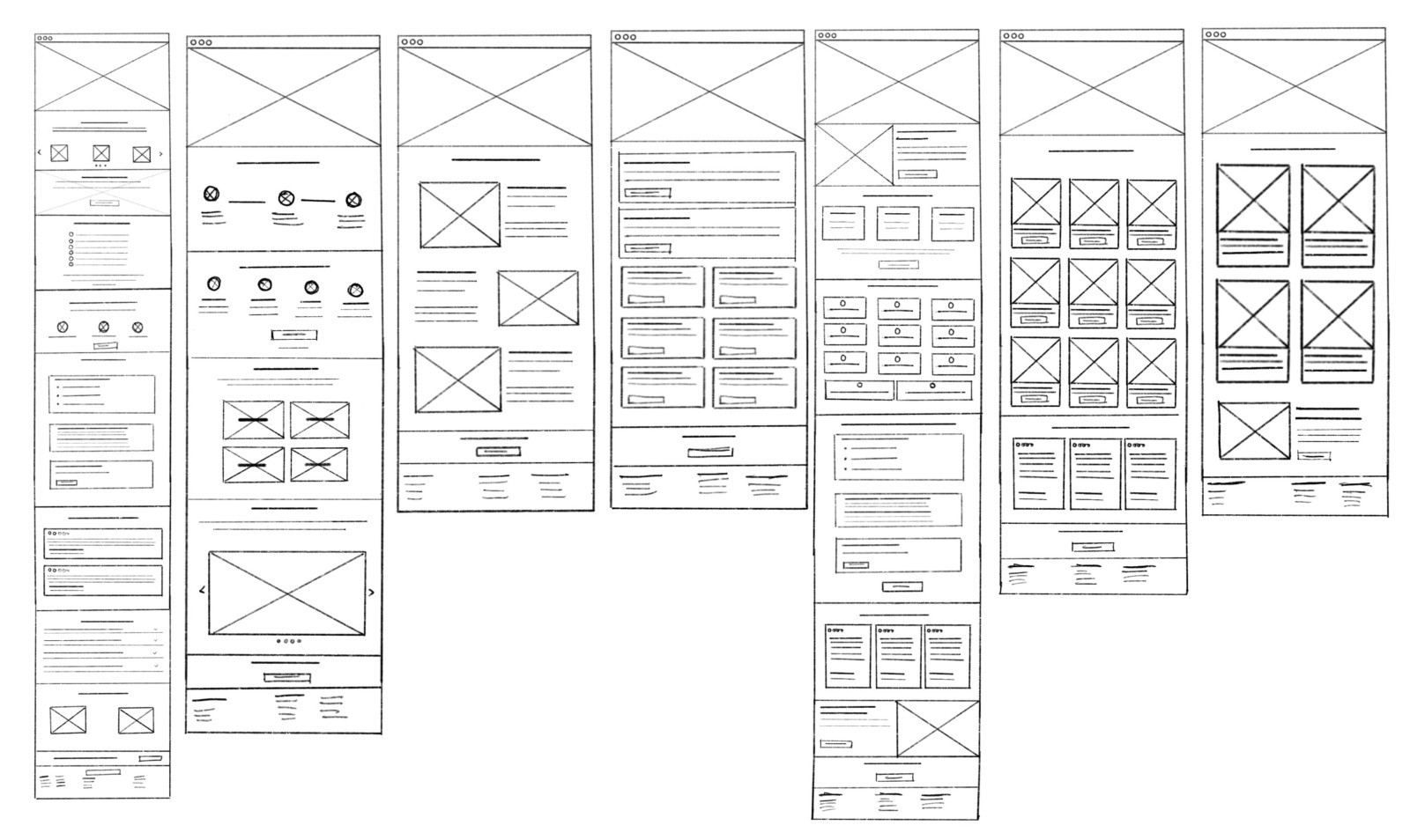
Reimagining the structure
Hand-drawn layout sketches were created to address the structural issues identified in the accessibility assessment, informed by client-provided content documentation.
- Created hand-drawn layout sketches addressing the structural issues from the audit
- Used client-provided content documentation to inform the redesign direction
- Added a new consolidated "Programs" page for streamlined course discovery
- Integrated testimonials on Home and Courses pages
- Merged Financial Aid into Admissions for a simpler flow
- Removed the Videos page and elevated the Blog section as the main content hub
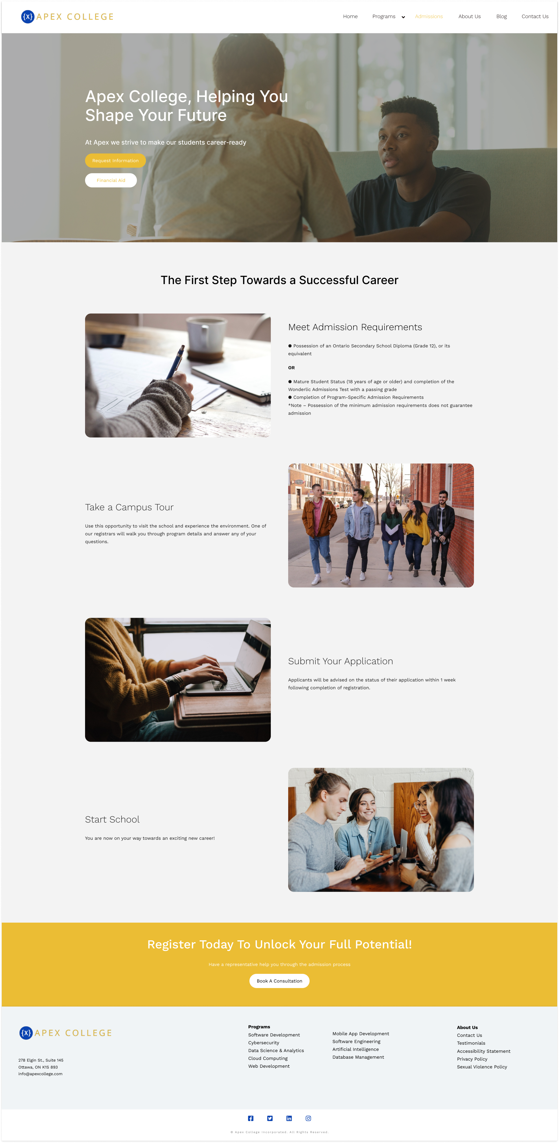
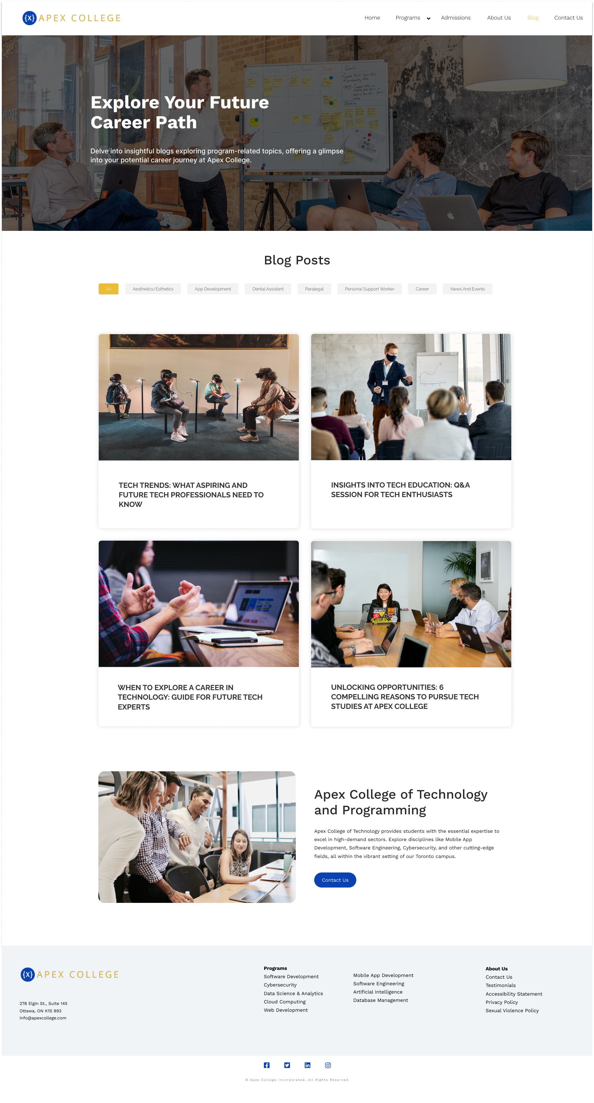
04 / Redesign
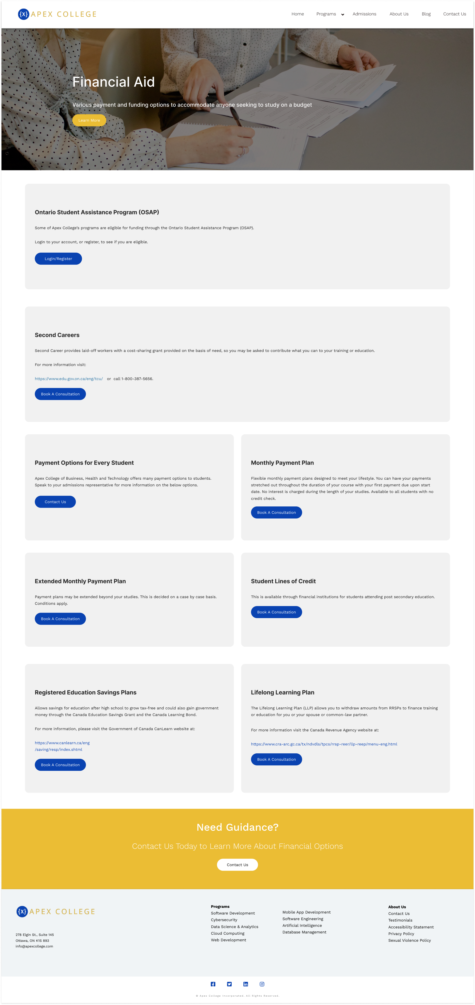
Building an accessible experience
Sketches were translated into high-fidelity mockups in Figma, with WAVE Tool's foreground color recommendations integrated throughout to hit full 4.5:1 contrast compliance.
- Translated sketches into high-fidelity mockups in Figma
- Integrated WAVE Tool's foreground color recommendations for full 4.5:1 contrast compliance
- Redesigned 7 pages: Homepage, About Us, Admissions, Contact Us, Course Page, Programs (new), and Blog
- Built a clickable prototype demonstrating full functionality and verifying all accessibility issues were resolved
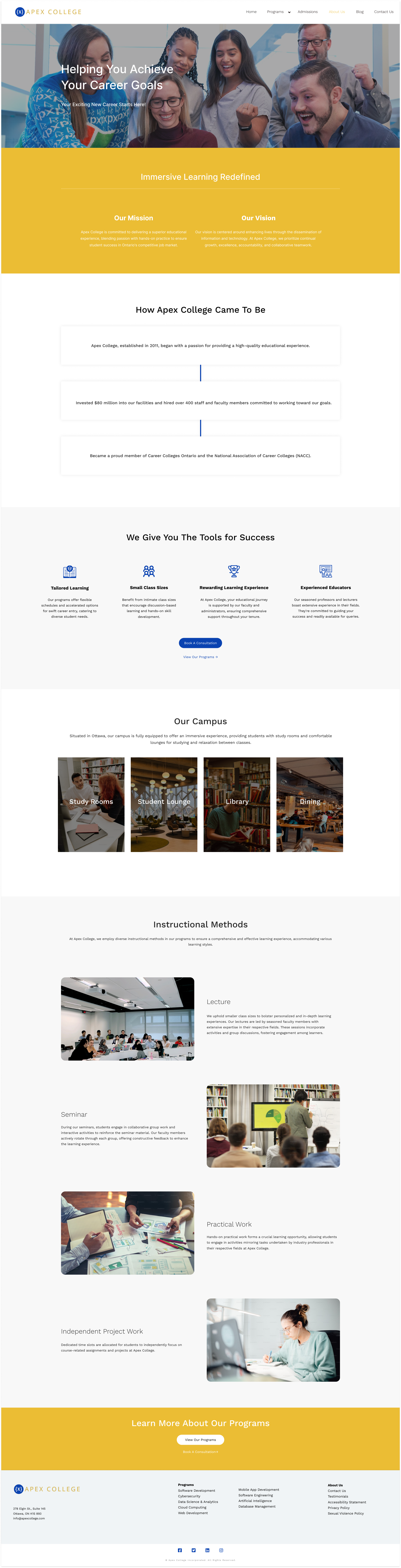
Key design decisions
- New "Programs" page consolidates all courses for easier exploration
- Testimonials integrated into Home and Courses pages to help student decision-making
- Financial Aid merged into Admissions: one less navigation item, simpler flow
- Videos page removed; Blog section elevated as the primary content hub
Before
- Contrast ratio: ~3:1
- Multiple images without alt-text
- 7 unfocused navigation items
- Financial Aid buried as separate page
- No testimonials
- No consolidated programs view
After
- Contrast ratio: 4.5:1 (WCAG AA)
- All images with descriptive alt-text
- Streamlined navigation
- Financial Aid within Admissions
- Testimonials on key pages
- Dedicated Programs hub
05 / Reflection
Impact and learnings
This project deepened my expertise in accessibility-first design. Using WAVE and W3C tools systematically exposed issues that visual inspection alone would have missed. The experience taught me that accessibility isn't an afterthought or a checklist. It's a design philosophy that, when built in from the start, produces better experiences for everyone.