Pulse Design System
Building a unified component library from scratch for a fintech startup scaling from 3 to 12 product designers.
01 / The Problem
Three products, twelve designers, zero shared components
When I joined the design systems effort, the company had three separate products shipping to web, iOS, and Android, each maintained by a different squad. There was no shared Figma library, no token system, and no documentation. Every team was building from scratch, and the results looked like three different companies had designed the products.
The most visible symptom was buttons. We had over 40 button variants scattered across the three products. Some had 8px border radius, some had 12px, and a few had none at all. Colors were hardcoded, type scales differed between platforms, and spacing was based on whatever felt right to the designer on that ticket. Design debt had become a real bottleneck. Engineers were spending hours asking "which version is correct?" and PMs were fielding customer complaints about inconsistent experiences across web and mobile.
The symptoms
- 40+ button variants across 3 products
- No shared Figma library or token system
- Hardcoded color values everywhere
- Inconsistent type scales between platforms
The cost
- Engineers blocked waiting for "correct" specs
- New designers took 3+ weeks to ramp up
- Every feature required reinventing basic patterns
- Customer complaints about inconsistent UX
02 / Audit & Inventory
Screenshotting every screen we shipped
Before building anything, I needed to understand the full scope of what already existed. I spent the first two weeks screenshotting every screen across all three products. That meant walking through every flow on web, iOS, and Android, capturing 180+ unique screens and cataloging every component I found.
The inventory revealed 340+ unique components, but the real finding was the duplication rate: 78% of those components were variations of the same patterns. We had 14 versions of a card component, 9 different input field styles, and 6 modal designs. The overlap was staggering, and it made the case for a shared system undeniable.
I organized everything into a priority matrix, scoring each component on frequency of use, inconsistency severity, and engineering effort to consolidate. This gave the team a clear build order so we could tackle the highest-impact components first rather than trying to boil the ocean.
- 180+ screens captured across web, iOS, and Android
- 340+ unique components cataloged with screenshots and annotations
- 78% duplication rate identified, with buttons, inputs, and cards as worst offenders
- Priority matrix created to rank components by impact and effort
- Shared findings with all 12 designers and 4 engineering leads in a cross-team readout
03 / Token Architecture
The invisible foundation that holds everything together
Tokens are the decisions that live beneath every component. Before drawing a single button, I built the foundational token layer that would govern color, typography, spacing, elevation, and border radius across all platforms. Getting this right meant every component built on top of it would automatically stay in sync.
The color system started with 12 core colors, each with a full ramp of 10 shades. On top of the raw values, I created semantic aliases like color.surface.primary, color.text.secondary, and color.feedback.error so designers and engineers would always reference intent rather than specific hex values. This made light and dark mode support nearly automatic: swap the alias mappings and the entire product updates.
Typography followed a similar philosophy. I defined 6 type scales with clear usage rules, making sure the same scale worked across web (where we used rem units) and native mobile (where we used platform-native scaling). Spacing used an 8-point base with 8 named tokens, and elevation went from subtle card shadows to prominent modal overlays in 4 levels.
Token layers
- 12 core colors with 10-shade ramps each
- Semantic aliases for all color usage contexts
- 6 type scales with cross-platform scaling
- 8 spacing units on an 8-point grid
Built-in flexibility
- Light + dark mode from day one via alias swapping
- 4 elevation levels for consistent depth cues
- 3 radius tokens (small, medium, large)
- Platform-adaptive typography units (rem vs. native)
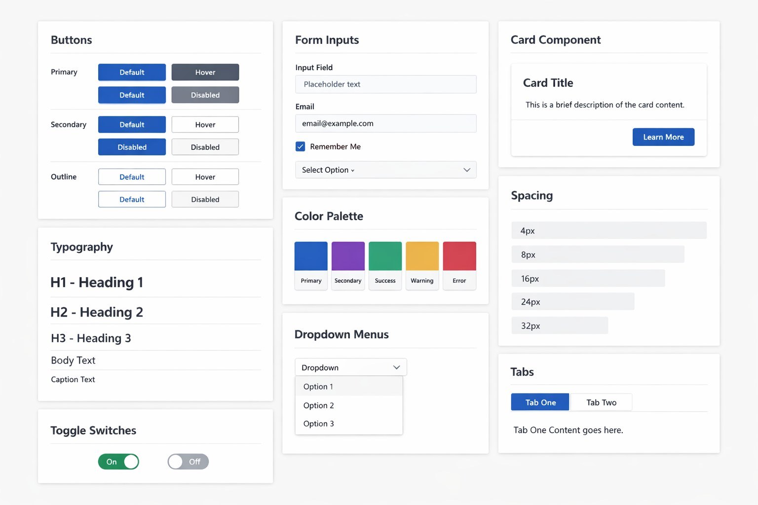
04 / Component Design
Atoms, molecules, organisms: 86 components in 3 tiers
With tokens in place, I followed an atomic design approach to build the component library. Atomic components came first: buttons, inputs, badges, icons, toggles, and checkboxes. These are the smallest building blocks, and getting them right set the quality bar for everything that followed. Each atom was built with full variant support (size, state, color) and tested across all three platforms.
Molecules combined atoms into reusable patterns: form groups, card layouts, navigation items, list rows, and search bars. These were where most of the UX decisions lived. How much padding between a label and its input? What happens when a card has no image? How does a search bar behave as it expands? I wrote detailed usage guidelines for each molecule so designers wouldn't have to guess.
Organisms were the most complex tier: headers, sidebars, modals, data tables, and onboarding flows. These required close collaboration with engineering since they involved state management, responsive behavior, and accessibility patterns that couldn't be fully captured in Figma alone. I paired with frontend engineers on each organism to make sure the design and code stayed aligned.
- 86 total components: 28 atoms, 34 molecules, 24 organisms
- Every component built with full variant and state support
- Cross-platform tested on web, iOS, and Android
- Accessibility baked in: focus states, ARIA labels, screen reader testing
- Figma components built with auto-layout and named constraints for easy adoption
05 / Documentation & Governance
A system nobody reads is a system nobody uses
I've seen too many design systems die because the documentation was an afterthought. For Pulse, I treated docs as a first-class product. Every component page in Zeroheight included a live preview, usage guidelines, do's and don'ts with annotated examples, accessibility requirements, and links to the corresponding Storybook implementation.
Governance was equally important. I established a contribution workflow so any designer could propose a new component or modification. Proposals went through a lightweight review process: submit a brief in the shared Figma file, get feedback in the bi-weekly design system office hours, and if approved, build it with token compliance. This kept the system growing without becoming chaotic.
Versioning followed semantic conventions. Minor updates (new variant, bug fix) shipped weekly. Major updates (new component, breaking change) shipped monthly with migration guides. I sent a changelog to the full design and engineering team after every release, which kept adoption high and surprises low.
- Zeroheight documentation with live previews, usage guidelines, and accessibility specs for every component
- Contribution workflow: proposal, review at office hours, build with token compliance
- Bi-weekly design system office hours open to all designers and engineers
- Semantic versioning with weekly minor releases and monthly majors
- Changelogs distributed to full team after every release
06 / Impact
A shared language for the entire team
The numbers told a compelling story. Design-to-dev handoff time dropped by 60% because engineers no longer had to interpret ambiguous specs or ask clarifying questions about spacing and color. New feature design time was cut by 35% since designers could compose screens from existing components instead of starting from zero. The most dramatic improvement was in zero-to-one screen builds: what used to take 3 days now took about 4 hours.
Adoption was the metric I cared about most, because a design system only works if people actually use it. Within the first month, all 12 designers had migrated their active projects to Pulse. By week 8, engineering teams across all three platforms were pulling from the shared Storybook instance. The system had become the default, not an optional tool.
Efficiency gains
- Design-to-dev handoff time: reduced 60%
- New feature design time: cut by 35%
- Zero-to-one screen builds: 3 days down to 4 hours
- Button variants: 40+ consolidated to 6
Adoption
- All 12 designers adopted within the first month
- 3 engineering teams using shared Storybook by week 8
- 86 components with 100% documentation coverage
- Bi-weekly office hours averaging 15+ attendees
Team feedback
"Pulse didn't just give us components. It gave us a shared language." - Senior iOS Developer