FitFolio
A personalized health and nutrition app with meal plans, progress tracking, and community support.
01 / Overview
The problem
Many people struggle to keep up healthy habits because they lack personalized guidance. Most health apps are either too complex or too generic, which leads to frustration and abandoned goals.
The solution
FitFolio is a health and nutrition app that gives users personalized meal plans, nutritional guidance, progress tracking, and a community to help them stick with their goals.
02 / Research
Understanding the user
- Ran competitive analysis of existing health and fitness apps, identifying gaps in personalization, community features, and holistic fitness tracking
- Conducted 5 in-depth user interviews with gym enthusiasts, health-conscious individuals, and people actively trying to build healthier habits
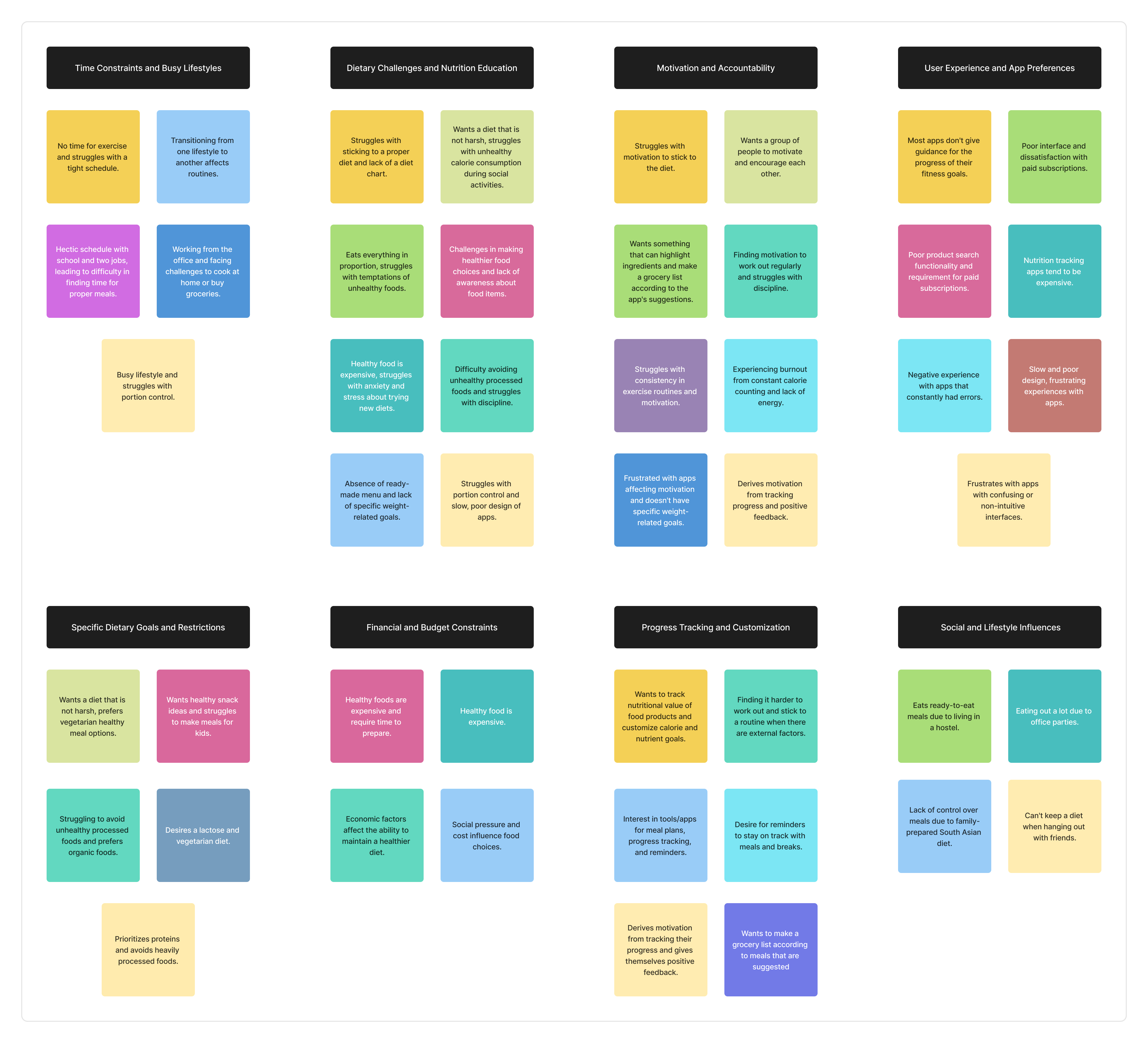
- Created affinity maps with 5 key themes: Unhealthy Eating Habits, Motivation Struggles, Time & Lifestyle Challenges, Knowledge Gaps, and Cooking Inexperience
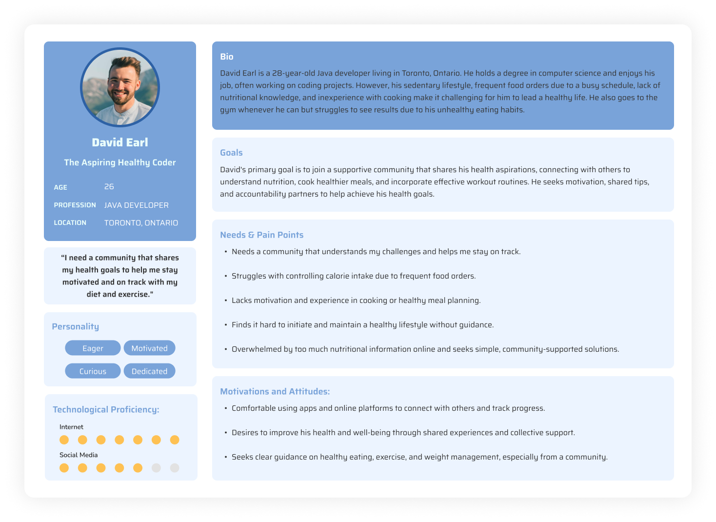
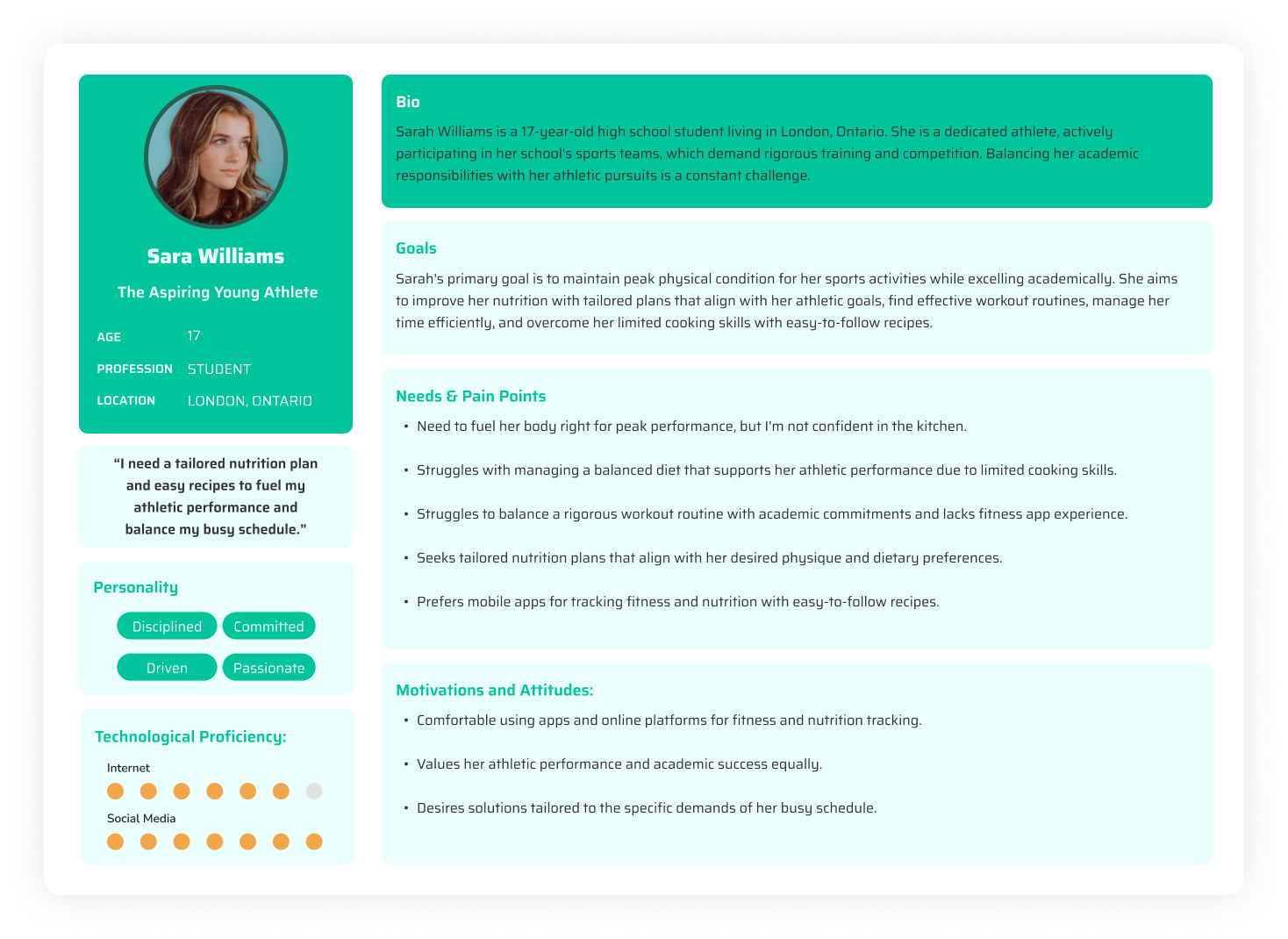
- Developed 2 personas: "The Aspiring Healthy Coder" (a Java developer with an inactive lifestyle) and "The Aspiring Young Athlete" (a student balancing sports with academics)
- Mapped the user journey across Awareness, Consideration, Decision, Service, and Loyalty stages
- Wrote How Might We statements focused on customized nutrition, progress tracking, and keeping users motivated
Key research insight
"Users consistently said they felt overwhelmed by apps that tried to do everything at once. They wanted simplicity with depth: easy daily actions backed by detailed tracking when they wanted it."
03 / Ideation
From insights to concepts
- Rapid ideation through Crazy 8's exercises: 8 distinct concepts visualized in 8 minutes each to explore the full solution space
- Defined MVP features through user stories covering personalized nutrition plans, calorie tracking, progress visibility, community support, and exercise content
- Developed information architecture to simplify user interactions and reduce cognitive load
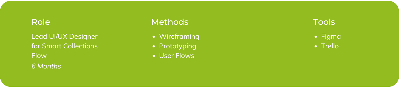
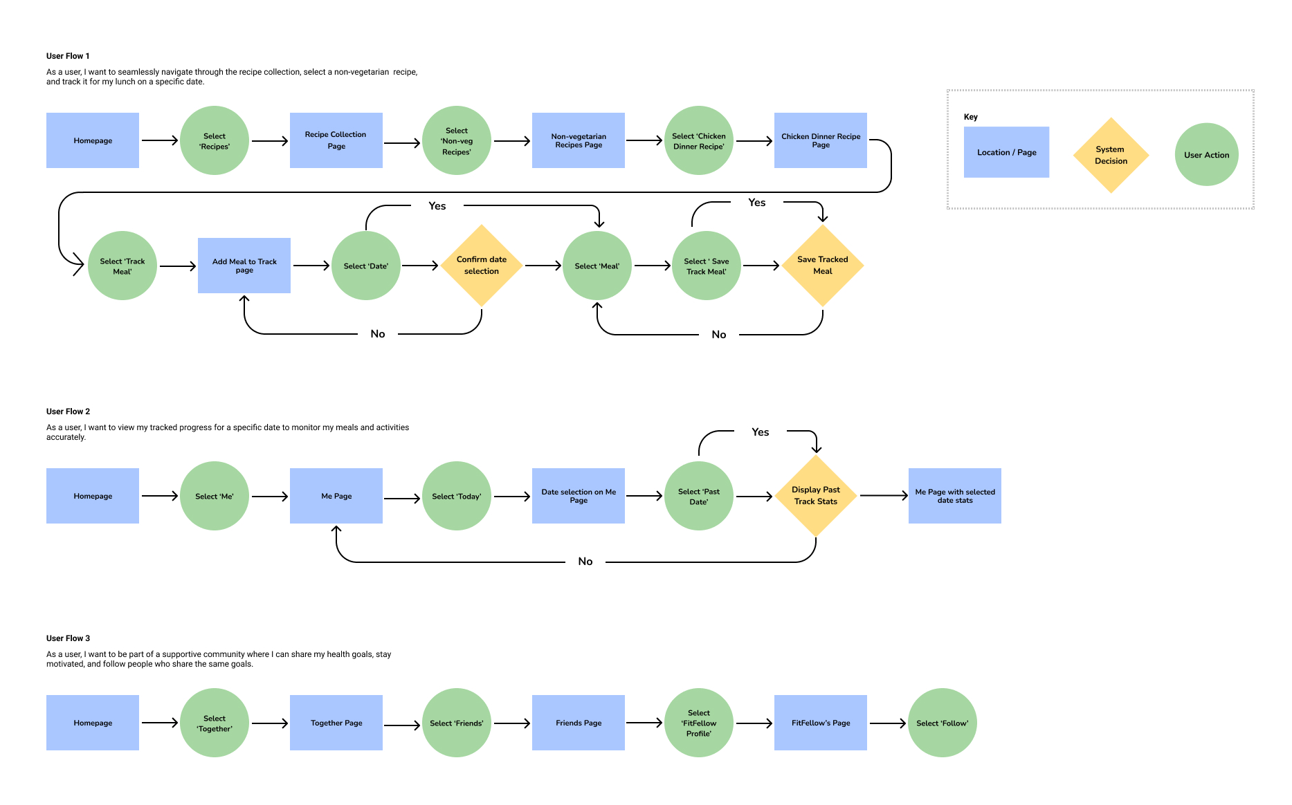
- Created collaborative user flows (I was responsible for flows 1, 2, and 3 covering onboarding, meal planning, and progress review)
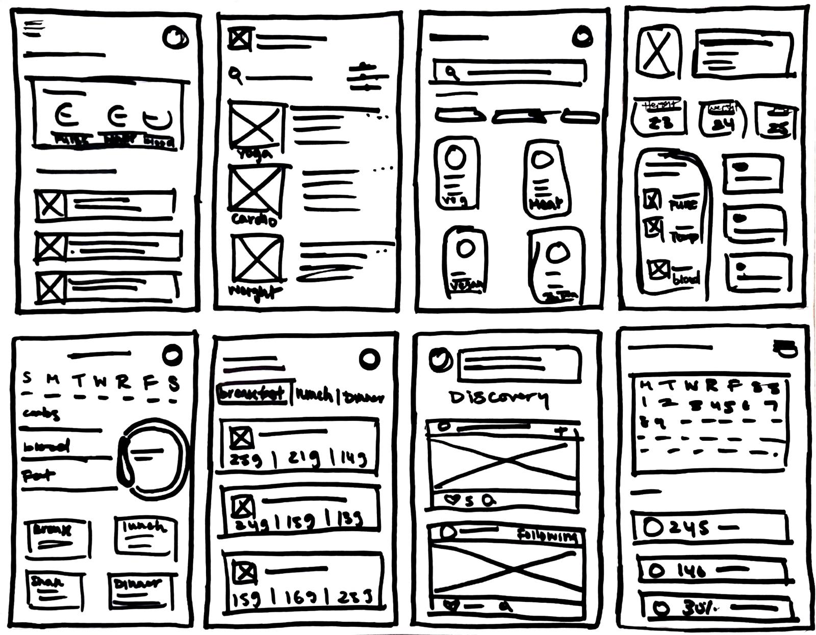
- Started with hand-drawn sketches, then iterated and refined them into structured digital layouts
04 / Design
Bringing it to life
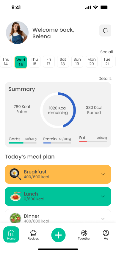
- Developed 29 medium-fidelity wireframe screens exploring multiple layout options per user flow
- Assessed each approach against HMW statements and user story criteria to validate direction
- Translated winning wireframes into 23 high-fidelity screens with a cohesive green and teal design system
- Built an interactive prototype in Figma with complete task flows ready for usability testing
Design Principles
- Simplicity first: reduce friction at every interaction point
- Progressive disclosure: surface complexity only when the user needs it
- Community-centered: social accountability as a core motivator
- Accessibility throughout: legible type, sufficient contrast, touch-friendly targets
Visual Direction
- Natural green palette conveying health, vitality, and calm
- Clean card-based UI for scannability and quick action
- Consistent iconography reinforcing meaning across all flows
- Generous whitespace to prevent visual overwhelm
05 / Testing
Validating with real users
Conducted moderated usability testing with 6 participants across 3 key tasks:
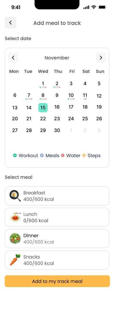
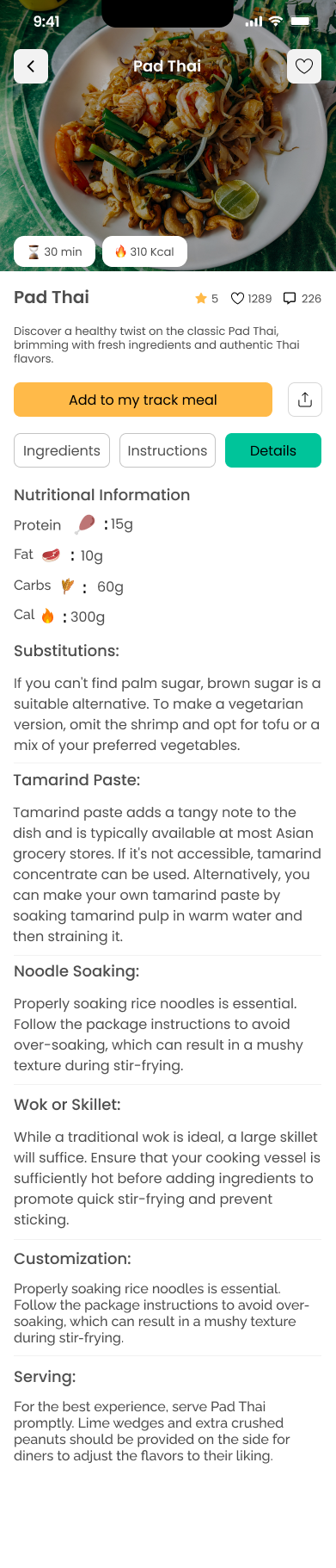
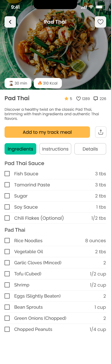
- 1. Find the Pad Thai recipe and schedule it for November 13th lunch
- 2. Review progress tracking starting from November 14th
- 3. Follow or unfollow a FitFellow in the community section
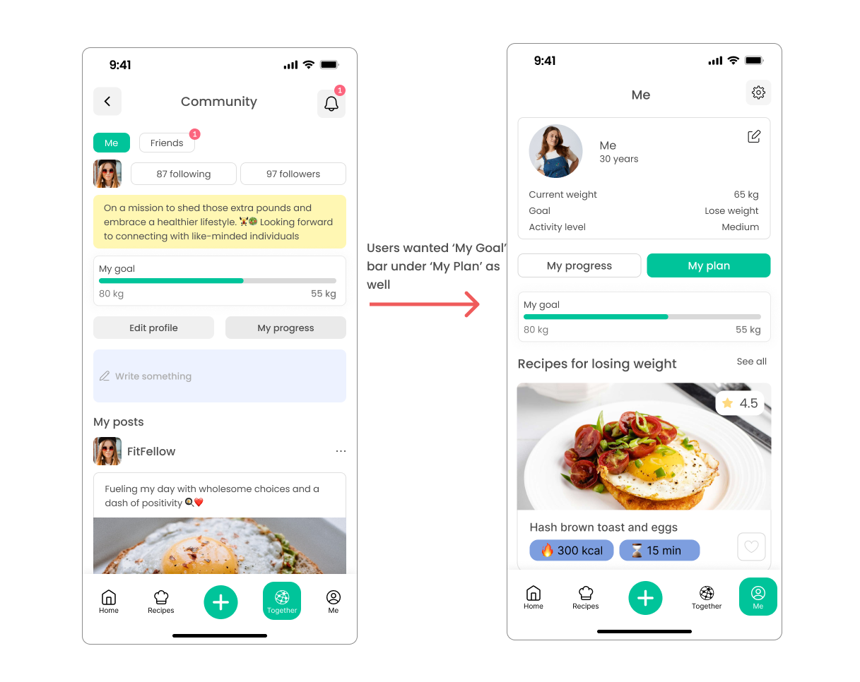
A post-test survey revealed that the goal progress bar should appear on more pages, not just in the community section. We iterated on all feedback: navigation patterns were redesigned and goal visibility improved across the full app.
Key finding
"100% of participants successfully completed all three tasks, but post-test feedback revealed a critical UX improvement: the goal bar needed visibility beyond the community page to keep motivation high throughout the experience."
06 / Reflection
What I learned
This project drove home the importance of iterative design. Building personas and user stories from real interview data kept every decision grounded in genuine needs instead of assumptions.
The usability testing phase was nerve-wracking at first, but it surfaced blind spots the team had missed during the design phase. The goal bar finding was a clear reminder that what feels obvious to designers is often invisible to users navigating an unfamiliar interface for the first time.